Have you ever wondered why some websites just click on your phone, while others feel like navigating a maze? That’s the magic of mobile optimization at play. In today’s digital age, where smartphones are more common than umbrellas, having a WordPress mobile-optimized site isn’t just a nice-to-have; it’s a crucial pillar of your online presence.
Mobile-Friendly Websites: The Cornerstone of Digital Accessibility
- Vast Reach: With over 4.1 billion mobile internet users worldwide, your website’s mobile version is often the first touchpoint for potential customers.
- User Engagement: A seamless mobile experience ensures that visitors stay longer and engage more deeply with your content.
The SEO Advantage
- Google’s Mobile-First Indexing: Since 2019, Google predominantly uses the mobile version of the content for indexing and ranking. A non-optimized mobile site can sink your SEO efforts faster than you can say “Page 2 of Google search results.”
- User Experience (UX) Matters: Google’s algorithm updates increasingly focus on user experience. A mobile-friendly website translates to better user engagement metrics like lower bounce rates and higher session durations, which in turn boost your SEO.
In essence, if your WordPress site isn’t optimized for mobile, you’re not just turning away potential visitors; you’re also slipping through the cracks of search engine rankings. Let’s ensure that your website isn’t just a drop in the digital ocean, but a lighthouse guiding users to your content.
Key Take-Aways:
- Focus on user-friendly mobile optimization.
- Prioritize responsive design and user experience.
- Incorporate clear navigation and accessibility.
- Optimize images and content for mobile screens.
- Test and refine based on user feedback and analytics.
1. Previewing Your Mobile Site: The First Step
Before diving into the technicalities, let’s start with a crucial question: How does your WordPress site look on a mobile device? Previewing your mobile site is the first step towards mobile optimization.
Using WordPress’s Theme Customizer
- Simple and direct, the WordPress Theme Customizer allows you to view your site on various devices.
- Navigate to ‘Appearance’ > ‘Customize’ to access mobile previews.
Alternative: Google Chrome’s Developer Tools
- For a more technical approach, Google Chrome’s Developer Tools offer an in-depth preview.
- Right-click on your site and select ‘Inspect’, then toggle the device toolbar to view your site on different mobile devices.
Tips for Effective Previewing
- Focus on layout shifts and image sizes.
- Look for text readability and link accessibility.
- Remember, your website needs to look great and function seamlessly on all screen sizes.
2. The Role of Responsive WordPress Themes
In the realm of mobile optimization, choosing the right theme is akin to setting a solid foundation.
Advantages of Responsive Themes
- Automatically adjusts to screen sizes, enhancing user experience.
- Responsive themes are essential for SEO, as Google prioritizes mobile-friendly sites.
Theme Influence on Mobile Version
- They dictate the visual structure and layout of your mobile site.
- Ensure compatibility with different browsers and devices.
Selecting Responsive Themes
- Choose themes labeled as ‘responsive’ in the WordPress theme directory.
- Test themes with tools like Google’s Mobile-Friendly Test to ensure they perform well.
To Get the free WordPress Themes Explore it Now!
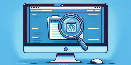
3. Leveraging Plugins for Enhanced Mobile Experience
To further refine your mobile website, WordPress plugins play a pivotal role.
Useful Plugins for Mobile Optimization
- Plugins like WPtouch swiftly add mobile-friendly themes.
- AMP for WP accelerates loading times for mobile users.
Customizing Menus and Images
- Employ plugins like Responsive Menu for a navigable mobile menu.
- Optimize images for mobile screens using plugins like Smush.
Avoiding Mobile Pitfalls
- Shun intrusive popups with plugins like Popup Maker, which offers mobile-specific settings.
- Remember, a clutter-free mobile experience is key to retaining visitors.
For more WordPress Plugins Come check this!
4. Testing and Improving Mobile User Experience
Ongoing testing and refinement are crucial in the mobile-first digital landscape. It’s not just about creating a mobile-friendly version of your WordPress site; it’s about continuously enhancing it to meet evolving user expectations and technological advancements.
Tools for Effective Mobile UX Testing:
- Google’s Mobile-Friendly Test is a great starting point for evaluating basic mobile functionality.
- Advanced tools like BrowserStack and Hotjar offer more in-depth insights, allowing you to test on various devices and understand user interactions.
Analyzing Feedback and Analytics:
- Regularly solicit user feedback, focusing on the mobile experience. This direct input is invaluable for identifying pain points and areas for improvement.
- Dive into your website analytics. Pay special attention to mobile user metrics, such as bounce rate, session duration, and conversion rates. These data points help in understanding how mobile users interact with your site and where enhancements are needed.
Remember, mobile optimization is an ongoing journey, not a one-time fix. Regularly testing, analyzing, and updating your site ensures it remains user-friendly, competitive, and relevant in the fast-paced mobile world.
5. Conclusion: Embracing Mobile Optimization for WordPress
In sum, mobile optimization for your WordPress site isn’t just a trend; it’s an indispensable part of your digital strategy. It’s about creating a seamless, engaging user experience across all devices, which in turn boosts your SEO and keeps your audience coming back.
Remember, the digital landscape is ever-evolving, and your site should too. Regularly refining and adapting your mobile site isn’t just beneficial—it’s essential. Embrace mobile optimization not as a one-time task, but as an ongoing commitment to your online presence and the satisfaction of your audience.
6. FAQ Section
Q: Can I edit a mobile version of WordPress?
Yes, you can edit a mobile version of your WordPress site. This is typically done using responsive themes or plugins that adapt your site’s layout to various screen sizes, including mobile devices.
Q: How do I make my WordPress site mobile friendly?
To make your WordPress site mobile-friendly, use a responsive theme that automatically adjusts to the screen size. You can also install plugins designed for mobile optimization, and ensure your images and content scale correctly on smaller screens.
Q: How do I resize my WordPress mobile website?
Resizing your mobile website in WordPress involves using a responsive theme. These themes automatically adjust the layout and content to fit different screen sizes, ensuring your site looks good on mobile devices without manual resizing.
Q: How do I change the menu for mobile view in WordPress?
To change the menu for mobile view in WordPress, you can use a plugin that offers mobile-specific menu settings or adjust the menu settings in your theme’s customizer. Some themes provide different menu configurations for desktop and mobile views.